
MilesWeb · 2022-2024
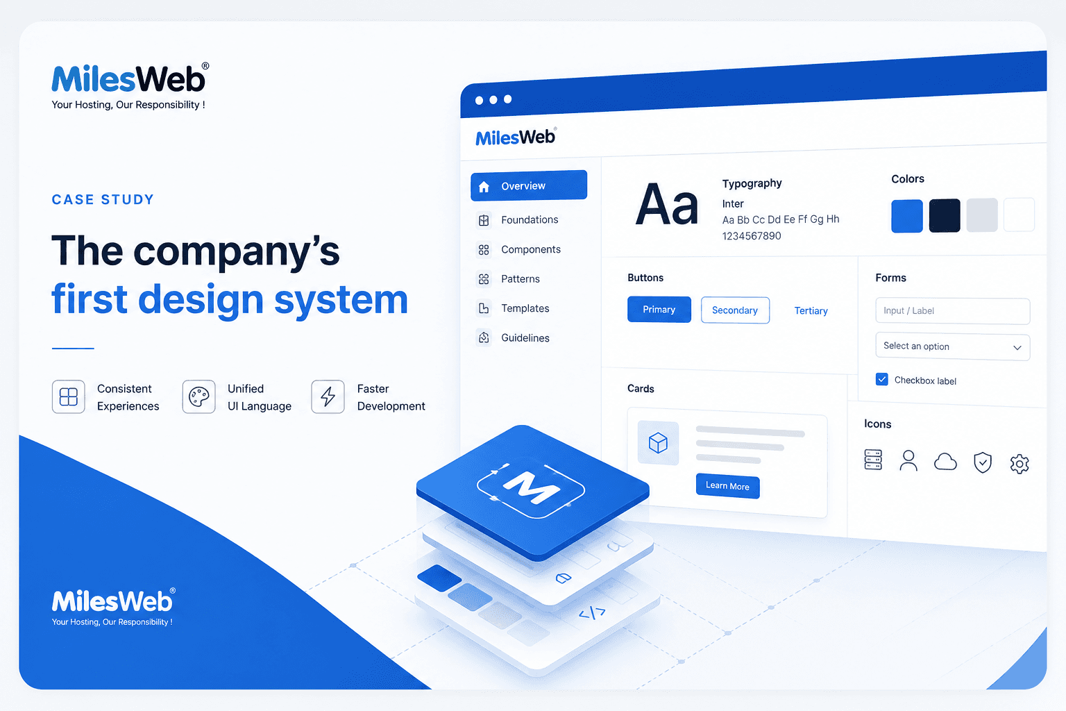
The company's first design system
From inconsistent UI to a system three products could share.
01
The Challenge
MilesWeb is a web hosting company whose website is really several products in one: shared hosting, WordPress, reseller, VPS, dedicated servers, and domains, each with its own pages, plans, and checkout. By 2023 every team was rebuilding the same things slightly differently. Buttons came in a handful of near-identical blues, headings landed at whatever size felt right, and the header was copied and tweaked page by page. The result was a site that looked subtly off from one section to the next, and a design process that reinvented the wheel on every feature.
I was tasked with building the company’s first design system: one shared language, adopted across three products, so the team could ship faster and look consistent doing it.
How do you turn a sprawling, inconsistent hosting site into one coherent system that three product teams can build on without slowing down?
02
Starting with an Audit
Before designing anything new, I audited what already existed. I went through the live products screen by screen and catalogued the drift, and the redundancy was the real story: the same components, rebuilt again and again with small, costly differences.
Buttons everywhere
Multiple blues, mixed paddings, and inconsistent corners. The same action looked different on nearly every page.
No type rhythm
Headings were sized ad hoc, so hierarchy shifted from page to page and nothing scaled cleanly on mobile.
Duplicated headers
The navigation was copied and hand-edited per page, so a single menu change meant touching many files.
That audit set the priorities: lock down the foundations, then standardise the few components that appear on almost every page, buttons, type, and the header, first.
03
Design Foundations
I started at the bottom of the stack with tokens, the decisions every component inherits. A focused brand palette replaced the scattered blues, with clear roles for each color, and the whole system was set in Open Sans for a clean, legible read at any size.
Primary
#408de4
Main actions
Bright
#198efa
Highlights
Navy
#061a40
Headers, footer
Success
#13b763
Buy / confirm
Accent
#feb73b
Promotions
Sale
#e51937
Offers
Color, with roles
Primary blue for actions, navy for structure, green to buy, amber for promotions, each with a defined job so usage stays predictable.
One typeface
Open Sans across the board, weights 400 to 700, so headings and body always feel like the same family.
Shared spacing
A consistent spacing and radius scale (a subtle 2px corner) so components sit together cleanly wherever they are placed.
04
Responsive Typography
Type was the first thing to systematise, because it shapes every page. I defined one scale with explicit sizes for each breakpoint, so a heading steps down gracefully from desktop to mobile instead of being re-guessed each time. Designers and developers now reach for a named style, not a pixel value.
- Powering your web presenceDisplay 56 / 44 / 34px - 700
- WordPress HostingH1 48 / 36 / 28px - 700
- Why choose MilesWebH2 36 / 30 / 24px - 700
- Free SSL and migrationH3 24 / 22 / 20px - 600
- Fast, secure, reliable hosting.Body L 18 / 18 / 16px - 400
- 24/7 expert support, every day.Body 16 / 16 / 15px - 400
- Starting at Rs 79 / moCaption 13 / 13 / 12px - 400
Each style carries its desktop, tablet, and mobile size plus a fixed weight. The same H1 is 48px on a wide screen and 28px on a phone, so the hierarchy holds and nothing overflows on small devices.
06
The Header Component
The header appears on every page, so making it a single reusable component had the highest payoff. I rebuilt it as one piece with a clear anatomy, a utility bar, the logo, product navigation, and a primary call to action, so any page drops it in and a menu change is made once, everywhere.
Utility bar
Contact, login, cart, and currency, the persistent top strip shared by every page.
Product navigation
One menu for all six product lines, defined once so it never drifts between sections.
Primary CTA
The same View Plans button from the button system, anchored consistently on the right.
07
The Component Library
From those foundations I grew the library outward to the patterns the products lean on most, into a set of 25+ reusable components covering actions, navigation, forms, content, and feedback. Each is documented with its variants and states so teams pull from one place instead of rebuilding.
Component library
26 components, 6 groups
Foundations
- Color tokens
- Type scale
- Spacing scale
- Icon set
Actions
- Button
- Icon button
- Link
- Pagination
Navigation
- Header
- Footer
- Breadcrumbs
- Tabs
Forms
- Text input
- Select
- Checkbox
- Radio
- Search field
Content
- Pricing card
- Feature card
- Comparison table
- Badge
- Accordion
Feedback
- Tooltip
- Alert banner
- Modal
- Toast
08
Adoption & Governance
A system only works if people actually use it, so I treated adoption as part of the design. Clear names, documented variants, and a single source of truth made the right choice the easy one.
Documented variants
Every component ships with its states and usage, so there is no guessing.
Clear naming
Predictable, role-based names so designers and developers speak the same language.
Single source of truth
One library feeding three products, updated in one place.
Built to reuse
Components composed from shared tokens, so consistency is the default, not the effort.
09
Impact
The system replaced one-off decisions with shared ones, and the effect compounded across the team.
25+ components
A reusable library adopted across three products, from buttons and the header to forms and pricing cards.
Faster per feature
New work starts from existing parts, so per-feature design time dropped instead of restarting each time.
Consistent by default
Three products that finally look and behave like one brand, with quality baked into the components.
10
Reflection
Building a company’s first design system taught me that the hard part is not drawing the components, it is the discipline underneath: agreeing on tokens, naming things well, and making the system easy enough to adopt that teams choose it over their old habits. The biggest wins were the least glamorous, buttons, type, and a shared header, because they show up everywhere.
If I took it further, I would move the tokens into code so design and development stay in lockstep, add a dark theme from the same variables, and grow the documentation into a living reference the whole company can build against.
Want the full story behind this work?
Let's Chat